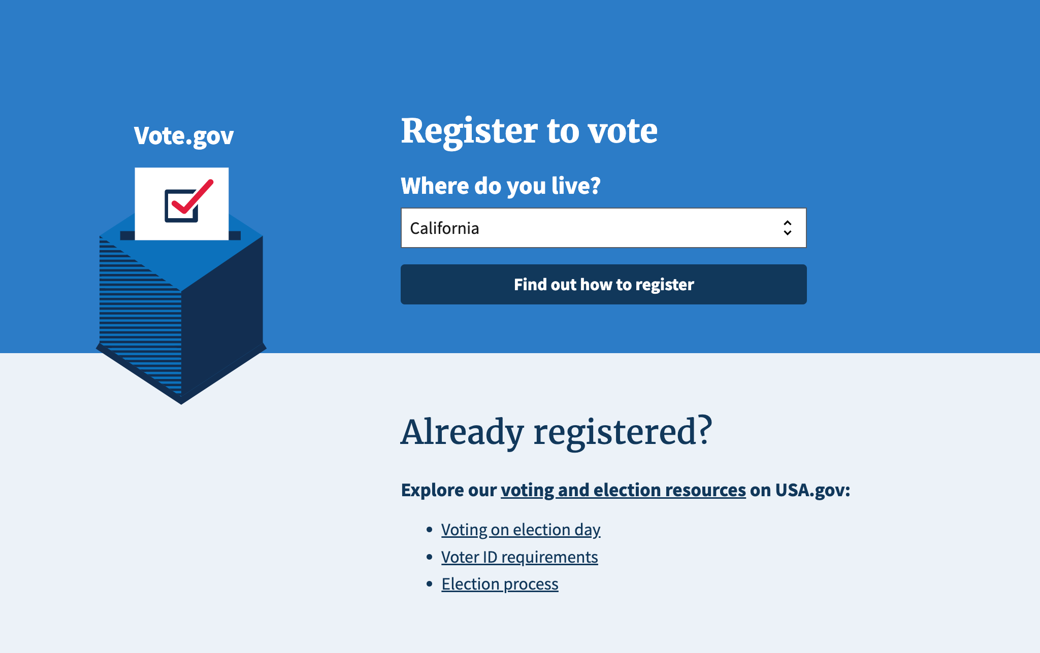
I led the front-end modernization of Vote.gov, redesigning the site to improve usability, performance, and accessibility — with the goal of making voter registration easy, clear, and more inclusive.
The challenge
- The original site had inconsistent UI patterns, slow performance, and usability barriers for mobile users and those relying on assistive technologies.
- States reported drop-off in voter registration workflows due to confusing form fields, unclear navigation, and friction in the registration flow.
What I did
- Overhauled the front-end architecture to support modern, responsive layouts across desktop, tablet, and mobile devices.
- Streamlined the registration workflow: simplified form fields, clarified instructions, and reduced steps to completion.
- Improved performance by optimizing asset loading, reducing page weight, and enhancing front-end code efficiency.
- Elevated accessibility standards: ensured Section 508 and WCAG compliance, and introduced better keyboard navigation.
- Collaborated with designers, content strategists, and state stakeholders to ensure the experience was clear, inclusive, and compliant.
Impact
- Record-breaking voter registrations were reported in several states after the relaunch.
- Mobile access and successful form completions significantly increased.
- The site became a more trusted, usable, and accessible destination for civic participation.
Takeaways
- Clarity and accessibility aren’t optional — they directly impact civic engagement and user trust.
- Even small UX improvements can dramatically boost conversions.
- Working across disciplines — front-end, design, policy — is key to building inclusive, high-impact government services.