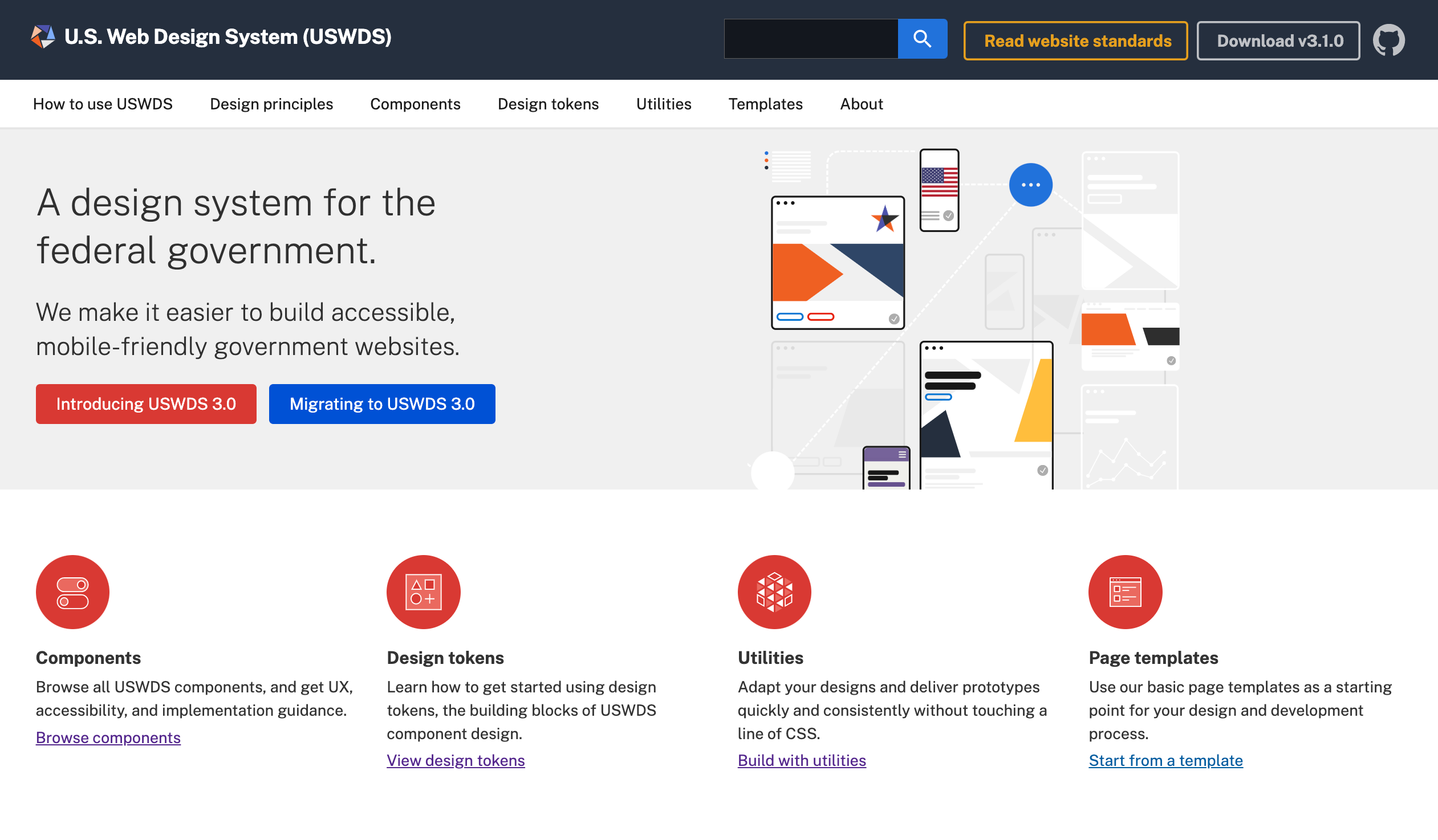
I led design, product, and front-end development for the U.S. Web Design System — the shared UI and style framework now used by hundreds of federal agency projects nationwide. My work focused on raising standards for user experience, accessibility, and consistency in government digital services.
What I did
- Designed and developed a robust set of common UI components built on a solid HTML foundation, enhanced with Sass, to ensure modular, maintainable front-end code.
- Ensured full Section 508 compliance and progressive enhancement so the system works across browsers and for all users.
- Created documentation, style guidelines, and developer-friendly patterns to help teams adopt the system quickly and correctly.
- Collaborated with multiple government agencies and front-end designers/developers to balance modular CSS with usability, maintainability, and consistency.
Outcomes & impact
- Widely adopted by dozens of federal agencies, leading to significant reductions in duplicate work and maintenance costs.
- Improved accessibility and usability across federal websites, making digital services more inclusive.
- Contributed to the launch of USWDS 2.0, with enhancements to modularity, flexibility, and design maturity.
- Made it easier for government design teams to hit the ground running — accelerating front-end development time and raising the baseline of public digital experience.
Learn more
- Read my case study on Smashing Magazine → deep dive into process and challenges.
- See how the system evolved in USWDS 2.0 → updates, new patterns, and improvements.
